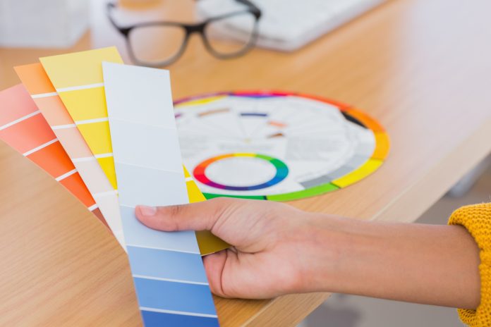
If you are getting your home ready to sell/rent, or you just moved in and want to freshen up the space, the colors you choose can affect more than what meets the eye.
For years, studies have proven that color choice can dramatically impact your day-to-day practices. Not only can they trigger memories or emotional connections, they also set the tone in a space.
It’s important to keep this in mind as you choose interior paint colors for your mobile home. Here are some examples of different colors and their emotional connection:
Red
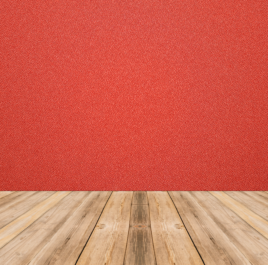
The color of passion, love and anger. Red is all of it! Red is a very high-energy color choice for a room. This is a solid selection if you want to be sure that the room is active and energized. It can be known to raise blood pressure, though, which is why you might want to reserve red for a living room or kitchen. These are the places you might have guests and social activities as apposed to a bedroom or a bathroom where you might want to keep the mood more relaxed.
Orange
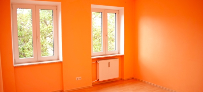
Like red, this color often is responsible for giving energy! It is a bright and alive color that is a great choice for a room where you want to keep energy flowing. Maybe an artistic space, a workout room or even using it as an accent in the garden or kitchen might sprinkle in some energy where it’s needed. However, orange is another of the interior paint colors you might want to avoid putting in a space where you want a calm mood.
Yellow
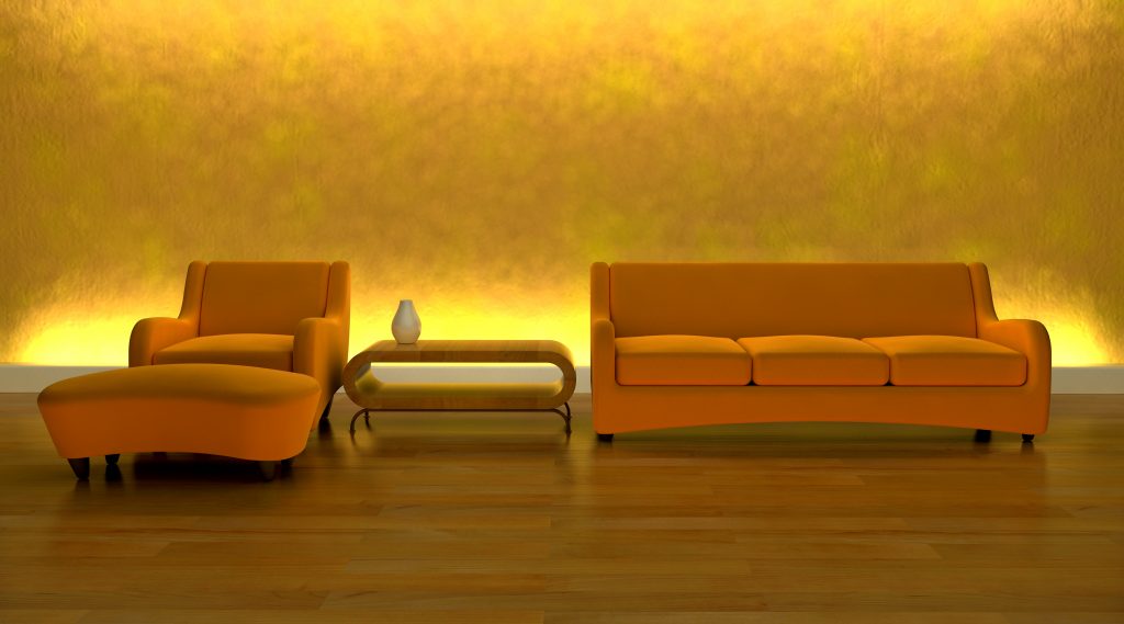
When you think of yellow, often you times you think of sunshine, flowers and the spring season. This is not an accident! This color tends to represent happiness and positivity with it’s bright tone and clean energy. Yellow is a great options for pretty much any room in the house, depending on the hue you choose. A softer more muted yellow can be a lovely choice for a guest room, or the kitchen, while a brighter or even a golden tone yellow paired with the right accessories can go very well in a dining or living room. Yellow also is a great option for a hallway or a smaller space since it can brighten up an area and provide the illusion of added physical space.
Green
Green always is a winner since it has such a broad spectrum of hues from which to choose. It is a color that easily complements or provides stellar contrast to other colors in the wheel, or even multiple green tones in the same space. Green gives a wonderful feeling of togetherness and often is felt as a refreshing vibe. It is another color that is great for any space in which you want to feel rejuvenated or calmed. (Fun fact: some also say it helps with fertility).
Blue
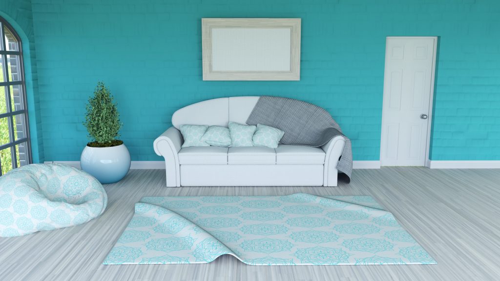
Here we have the the epitome of calm when it comes to the color wheel. blue is known to lower the blood pressure and create a serene and mellow space, which is why you often see blue in hospitals and doctor’s offices. Similar to green in feel, there are a spectrum of blue tones to choose, and you can find one that goes well with any palette. If you want a warm and cozy feeling, a navy or darker blue is a great base. Or, if you are going for more of an open or serene energy try a sky blue with white accents.
Blue is also an excellent option for a bathroom since most complexions are complimented well with blue tones.
Purple
Purple is the color of royalty and regal energy. It will instantly give a sophisticated and lush feel to a room, particularly when you stay in the spectrum of darker purples. A lighter purple still can provide an air of sophistication, but it tends to dip more into the blue world of calmness depending on the shade. Purple is a great option for a master bedroom fit for a royalty, and adds a nice formal touch to a dining room.
Neutral Tones
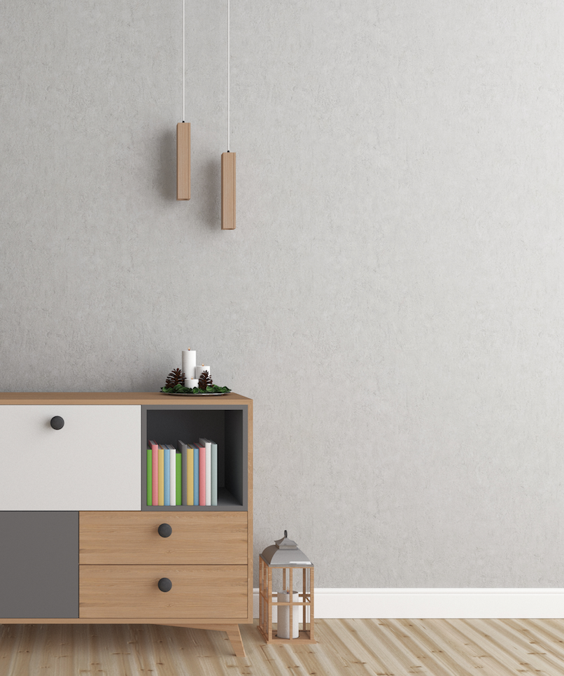
Neutral tones always are a safe option if you are looking to sell or rent a home. Going with a “colorless” wall, for instance, provides a blank canvas appeal that allows a new owner or resident to envision themselves in a space.
While it might sound like just painting everything white is a good idea, this is not always the case. White can be a very revealing color as well. White also is quite difficult to keep clean. Try going with calming light gray tones that will pull in a few of the blue emotional connections, or off-white shades for space you want to feel calm and welcoming. Then you can play with contract and color in the accessories. We have a great article on staging your home here!
Hopefully this article works as a helpful guide for you as you navigate the journey of interior paint colors for your home!


